Wednesday, 14 September 2011
Sleek Nude Collection
I recently purchased the nude collection from Sleek Makeup at my local superdrug store. I think the offer was something to do with the new Beauty Card that they have launced so effectivly you do save a little money. The collection looks amazing!!! It's all the colours I love and all the colours that most people would wear for that everyday work/school/wearable look. Sleek it a great line and the shadows are known for their amazing quality. This collection isn't any different. The quality if still there and I love it. LOVE IT! Most of the swatches come up ture to colour and there is a good range from light to dark colours that most people can make work for them. I have swatched every colour in the Nude palette and the blush (I believe it's called Suede). This blush works so well for me and I think it would work well for most people. The packaging is mostly the same as others from the Sleek line. There is a difference in the blush packaging but not much difference. It just stands out as a limited edition rather than a permenant line. So here are my pics that I managed to take. Once again, most of the colours do show up true to reality.
Here are the swatches of the palette:
The blush images can be seen here:
I also purchased a pout polish but it seem pointless to show you. It appears nude in the packaging but just looks like a clear gloss on the lips. It's called Bare Minimum and it really in the minimum. You can't see a colour at all on the lips.
Labels:
blush,
Collection,
nude,
palette,
pout polish,
review,
sleek
Tuesday, 13 September 2011
Fall (Autumn) Nails!!!
I'm not the biggest nail fan ever (I bite mine.... I know, it's like a beauty sin or something but I can't help it). I did a little research and now I bring you Fall Nail Trends (some will be cheap and some from the more expensive lines).
My inspiration for this post came from Missglamorazzi's video on Fall Nails. Check out her video here: http://www.youtube.com/watch?v=X1iSnMiBwTA&feature=feedu
Here are my favourites of her picks:
Essie Lady Like:
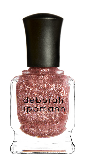
Miss Glamorazzi suggested wearing this under Deborah Lippmann's Some Enchanted Evening, which is a great pinky glitter polish.
On the Essie website the colour is descirbes as an elegant soft mauve colour, but it's currently unavalible for purchase online (on their website at least)
The second of my favourites from her selection is: Zoya Jem.
The zoya website definatly gives more information about the polish than the essie site. So here's what the site said:
It's described as a "dark red toned puple base with metallic dark pink highlights and subtle gold duochrome flecks. It's said to be a bold colour with vampy drama with bright sparkle and a glam rock persona. It's in the red and purple colour family and the finsih is most definatly metalic. The colour intensity is 5. The site five a scale of 1 to 5 where 1 is sheer and 5 is opaque. The colour tone is listed as cool and the polish came out in the mirrors collection.
OPI (as im sure most nail brands are doing) are releasing a fall collection this year and obviously these colours are going to be bang on trend. Check out the art work and the whole collection at this link (here) The collection is called "Touring America" and here are some of my favourites:
Color To Diner For:
This colour is inspired by Tucson, Arizona. The OPI site says "Rain? What's that? Boasting an average of 350 sunshine filled days a year, Tucson epitonmizes the warmth and beauty of the American Southwest..."
The colour is said to be "rosy red with a side of awesome".
Honk If You Love OPI:
This colour is inspired by Baltiore, MD. The site says "Theres something eternally nostalgic about a good ol' American roadside diner. We say skip the fast food when Touring America, and opt for some countertop dining instead. This is your time to indulge, so try the grilled cheese or a slice of pie. but dress sexy (just in case). The colour is descirbed as "delicious dark grape".
Road House Blues:
This colour is inspired by Jackson Hole, WY. It says "These jaw dropping peaks have been called the most spectacular and awe-inspiring mountain ranges in America. with heights reaching over 7000 feet into the sky, the Teton Range is something you have to see when Touring American. This colour is said to be "R&B", OPI stating that it now stands for "Really Blue".
French Quater For Your Thoughts:
Inspired by New Oreleans, LA. The OPI site says "Also known as Vieux Carre, the French Quarter is New Orleans' oldestande most famous neighbourhood. Touring America wouldn't be complete without surrounding yourself in its elegant mix of Spanish, French, Creole and American architechture. It's enough to take your breath away. This colour gives you those "sexy grey nails".
Some of the colours in this collection don't scream fall to me but most of them do. The colours that seem sort of lost in here would have to be:
One final colour screams fall to me from what I've seen and that is not just in nail polishes but in clothes and just general fall colours. That colour is Mustard.
Two polishes that stand out to me personally are Butter London in shade Bumster. The images can be seen below with the China Glaze polish in Trend Setter. These are what I call "Marmite" colour and you either love them or hate them. On the right skin tone... I love them!
My inspiration for this post came from Missglamorazzi's video on Fall Nails. Check out her video here: http://www.youtube.com/watch?v=X1iSnMiBwTA&feature=feedu
Here are my favourites of her picks:
Essie Lady Like:
Miss Glamorazzi suggested wearing this under Deborah Lippmann's Some Enchanted Evening, which is a great pinky glitter polish.
On the Essie website the colour is descirbes as an elegant soft mauve colour, but it's currently unavalible for purchase online (on their website at least)
The second of my favourites from her selection is: Zoya Jem.
The zoya website definatly gives more information about the polish than the essie site. So here's what the site said:
It's described as a "dark red toned puple base with metallic dark pink highlights and subtle gold duochrome flecks. It's said to be a bold colour with vampy drama with bright sparkle and a glam rock persona. It's in the red and purple colour family and the finsih is most definatly metalic. The colour intensity is 5. The site five a scale of 1 to 5 where 1 is sheer and 5 is opaque. The colour tone is listed as cool and the polish came out in the mirrors collection.
OPI (as im sure most nail brands are doing) are releasing a fall collection this year and obviously these colours are going to be bang on trend. Check out the art work and the whole collection at this link (here) The collection is called "Touring America" and here are some of my favourites:
Color To Diner For:
This colour is inspired by Tucson, Arizona. The OPI site says "Rain? What's that? Boasting an average of 350 sunshine filled days a year, Tucson epitonmizes the warmth and beauty of the American Southwest..."
The colour is said to be "rosy red with a side of awesome".
Honk If You Love OPI:
This colour is inspired by Baltiore, MD. The site says "Theres something eternally nostalgic about a good ol' American roadside diner. We say skip the fast food when Touring America, and opt for some countertop dining instead. This is your time to indulge, so try the grilled cheese or a slice of pie. but dress sexy (just in case). The colour is descirbed as "delicious dark grape".
Road House Blues:
This colour is inspired by Jackson Hole, WY. It says "These jaw dropping peaks have been called the most spectacular and awe-inspiring mountain ranges in America. with heights reaching over 7000 feet into the sky, the Teton Range is something you have to see when Touring American. This colour is said to be "R&B", OPI stating that it now stands for "Really Blue".
French Quater For Your Thoughts:
Inspired by New Oreleans, LA. The OPI site says "Also known as Vieux Carre, the French Quarter is New Orleans' oldestande most famous neighbourhood. Touring America wouldn't be complete without surrounding yourself in its elegant mix of Spanish, French, Creole and American architechture. It's enough to take your breath away. This colour gives you those "sexy grey nails".
Some of the colours in this collection don't scream fall to me but most of them do. The colours that seem sort of lost in here would have to be:
- Are We There Yet?
- I Eat Mainly Lobster
- My Address is "Hollywood"
One final colour screams fall to me from what I've seen and that is not just in nail polishes but in clothes and just general fall colours. That colour is Mustard.
Two polishes that stand out to me personally are Butter London in shade Bumster. The images can be seen below with the China Glaze polish in Trend Setter. These are what I call "Marmite" colour and you either love them or hate them. On the right skin tone... I love them!
Labels:
butter london,
china glaze,
dark,
essie,
fall 2011,
mauve,
midnight,
mustard,
nails,
OPI,
pink,
touring america,
trends,
vampy,
zoya
Everyday Makeup
So, this is the look that I wear on my eyes everyday for college and work. Hope this helps you discover your everyday look.
So, first up this is the look, the picture quality isn't great but hopefully it will give you an idea.
I applied this using a foundation brush that I brought from Primark. This foundation brush is actually better than the brush that I got a superdrug, even if it is Primark.
After I applied this all over the lid and up to the brow bone I took my eyeshadow quad from Avon. It's called colour trend and it's in the set Flirty Eyes: Bashful Browns. the quad is made up of 4 cream shadows that would can create simple and dramatic looks. It comes in a round tube with a hidden compartment for a sponge applicator. I always find it best to apply cream shadows with my fingers so I've used the applicator for other powder shadows that I have. I used two colours from this quad. I used the first two colours that are cream and light brown. I took the cream colour and applied it to the inner corner of my eyes, just so they looked more awake and wider. I also applied a very sheer coat as a highlight below my brow bone. I used the brown to provide sheer colour to my lid. I just used this up to the cream and it gave my eyes some shimmer and a little bit more colour.
I added a little gloss to my lips just so they weren't nude but I didn't want to much colour. I used sally hansen's diamond 12 hrs lip treatment in the shade honeymoon. I applied a very sheer layer. It's a good colour to make your lips a pop.
So, first up this is the look, the picture quality isn't great but hopefully it will give you an idea.
I applied this using a foundation brush that I brought from Primark. This foundation brush is actually better than the brush that I got a superdrug, even if it is Primark.
Next up I applied concealer to the areas that I want to cover up, to my under eye and my eyelids. I apply it to my eyelids because I have veiny eyelids that look better when covered up. I used Rimmel Match Perfection Concealor. It says that it's a skin tone adapting product that is also a 2 in 1 concealoer and highlighter. I have this in the sahde ivory which is 010. It comes in a tude that has a brush applicator attached but I till used the product on the back of my hand and applied it with a separate brush, also a brush from Primark.
Newxt I applied my eyeshaow. This isn't essential to the look but I like a little colour on my lids. I used 3 shaodws for this look. First I applied MUA shade 17. It's a matt colour, and it's a very light brown colour. It's barely visable on the lids but it does even the lids out and provides a great base for any other colours. I applied this with my fingers, just for quickness.
I added a little gloss to my lips just so they weren't nude but I didn't want to much colour. I used sally hansen's diamond 12 hrs lip treatment in the shade honeymoon. I applied a very sheer layer. It's a good colour to make your lips a pop.
PIGMENTS!!
I wanted to try some pigment loose eyeshadows and I didn't want to pay stupid money for it so I got some of eBay. They were really cheap and they are good, well I think they are. They are Korean and are labelled Qiaoyan (I assume that's the brand??). They aren't the biggest pots but for the price they are great. I've got some pictures and swatches to post but the colours sometimes dont come off as they are in reality.

As you can see from the picture the pots aren't that big but they are quite full. I did have a bit of a problem getting some of the lids off and I have two colours that I couldn't swatch because I couldn't get them open. The picture to the right is just to give you an idea about the size and look of the pigments. The top image is more the real colour of the pigment, the bottom one is much more pink than reality.
The three pictures below are the pigment colour ranges. The first one is all the colours and the other two are closer images of the colours so you can see them a little better.

These two pigments are the ones that I couldn't open. I will swatch them when I can.
If anyone is looking to test out pigment use then I suggest the ebay pigments as a good cheap way to test if you like them.

As you can see from the picture the pots aren't that big but they are quite full. I did have a bit of a problem getting some of the lids off and I have two colours that I couldn't swatch because I couldn't get them open. The picture to the right is just to give you an idea about the size and look of the pigments. The top image is more the real colour of the pigment, the bottom one is much more pink than reality.The three pictures below are the pigment colour ranges. The first one is all the colours and the other two are closer images of the colours so you can see them a little better.
Below this bit of text are the swatches of the colours. There aren't any names so here they are:
The colours are nice, maybe a little glittery for everyday. The bright pink is kinda scary but I'd love to be brave enough to ware it. I love the pale colours, they would be great highlights and the browns are brilliant colours that I will defiantly be using for my next night out.
The blues and the greens are nice but don't really suit me but I will give them a try. I cannot pull the black off because it's far to dark for me. I think I could get use out of most of these pigments and it's nice to have some variety to my collection.

These two pigments are the ones that I couldn't open. I will swatch them when I can.
If anyone is looking to test out pigment use then I suggest the ebay pigments as a good cheap way to test if you like them.
Monday, 12 September 2011
MAX FACTOR's Smooth Effect Foundation
I wanted to try a new foundation and I choose to buy Max Factor's Smooth Effect Foundation. The shade that I decided was best for me was Creamy Ivory and is was number 45. The packageing is rather simple, it' just a squeezy tube. It's kind of expensive for what you get but I got it on offer at superdrug. I got a False Lash Effect Fusion Mascara (which I loveeee) and this foundation for £12.99. Considering the Mascara is 10.99 alone, I think I got a good deal. The packaging says that it glides on effortlessly for a smooth and even finish. It's also oil free and states that it's won't clog pores. I find that it gives a light coverage, maybe just a little more than a tinted moisturiser would. I don't have oily skin, I have dry skin and this foundation hasn't left my skin dry or made it oily. Overall it's not a bad foundaiton but it's not the best either. I found some cheaper foundations that are better and more expensive foundations that are worse. So, it's ok in my conclusion.
Primark Goodies
So, I am sure that people are sceptical about cosmetics from Primark, and to be honest I was too but I saw this kits for £2 each in Oxford Street. The kit that I got was called Smoke Screen: Smokey Eye Kit. Its okay but it just proved to me that I cannot pull of black. I'm glad I didn't waste to much on something like this. The brushes are awful and it pains me that they are sooooooo awful but it's primark and I don't expect that much. The liners are ok and the shadows are pigmented and ok for the price. Overall this kit is ok but nothing amazing and buying things in this kit seperatly and in colours that you want and can pull off might be better. It may be more expensive but you will use it and it won't go to wast.
Labels:
black,
brush,
grey,
instructions,
kit,
liner,
primark,
smokey eyes,
swatches,
white
Subscribe to:
Posts (Atom)